UI
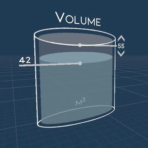
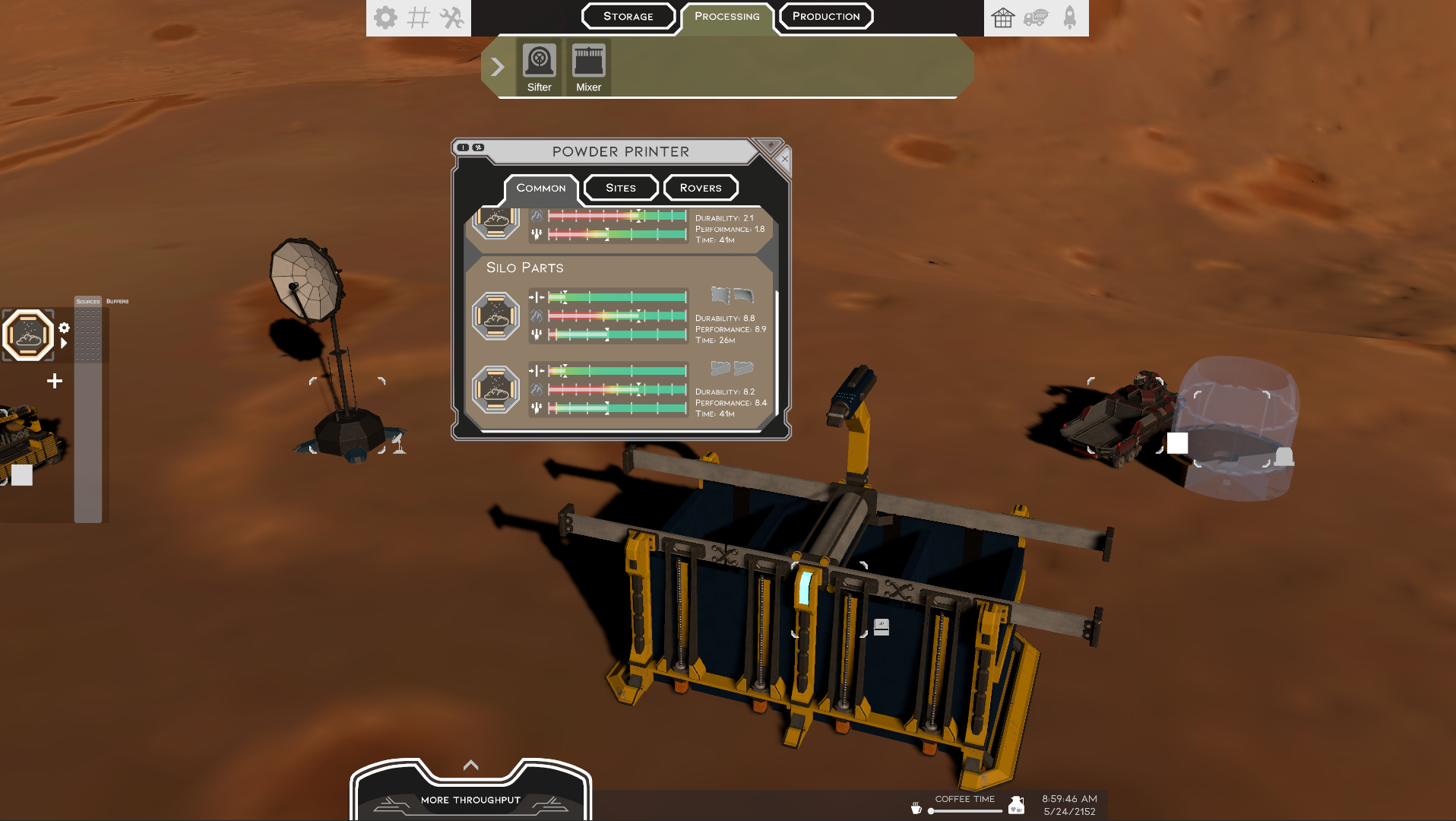
As we continue to reveal details about LithoBreak, we want to make it clear that it incorporates some complex topics while also being approachable and fun. While the simulation stack incorporates orbital mechanics, heat transfer, materials science, and more, our goal is to highlight the concepts intuitively to create an inviting sci-fi verse.
A key part of keeping the game approachable is great UI, and we are honestly not there quite yet. The interfaces throughout this post are in active development and we welcome feedback through discord.
Informative
We aim to nail a sci-fi look while portraying immediately useful imagery of the processes. Everything should be easy to discern and quick to control, or we will redesign it until it does.
Intuitive
Aside from those that build massive factory complexes, there should be no reason to use a calculating device besides your own grey matter. The concepts can be complex, but with enough clear information even thermitic thermodynamics is easily conceptualized.
We also aim for the overall designs and swappable color pallets to be friendly to all users.
Inspiring
Our goal is to have every image be informative and every slider feel empowering. This circles back to putting you in the boot of a deep space scientist. Changing a slider or moving a material in the UI has meaning in the simulation stack.
More than anything, we want you to have an experience worth remembering.
Refining these interfaces is and will be an iterative process. Feedback is greatly welcome. We invite you to join us on discord.


